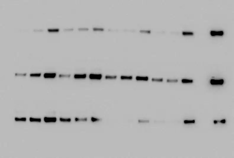
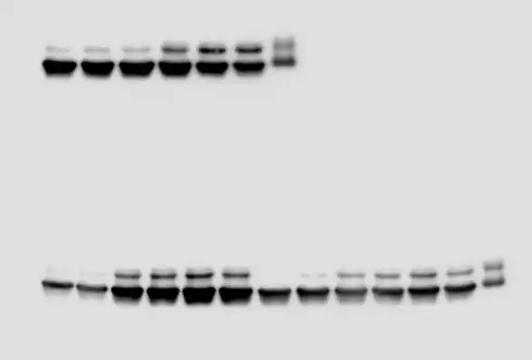
After you've imaged your blots and exported the raw image files to a .tiff/.jpg/.png format, you should end up with something like this.
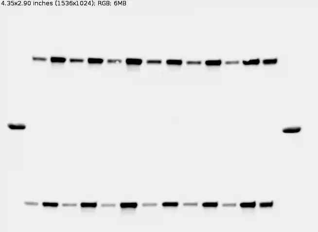
You can clearly see that some bands are darker than others, but to prove this, you'll need to perform statistical analyses. However, stats packages like Prism do not "understand" nor "see" image files. You need to first convert those bands into something that Prism understands — numbers. To do that, we will be using a program called ImageJ.
Before you begin:
To make valid comparisons across different experiments, you would always want to calculate foldchanges which I will explain in further detail in the analysis section. To be able to do this, you'll need to ensure that (1) you ran your gels and blotted them with a control group located on the same gel as your other groups of interest; (2) you imaged the control group and your other groups of interest at the same time under the camera. This should already be the case if you've planned and performed your westerns correctly.
Quantitation
-
Pick up a copy of ImageJ from here and install it on your PC.
Note: There are also other distributions of ImageJ available that offer more features such as ImageJ2 and Fiji (Fiji Is Just ImageJ), but for westerns, the standard one is more than enough. -
When you launch ImageJ, you'll be greeted with this interface.
-
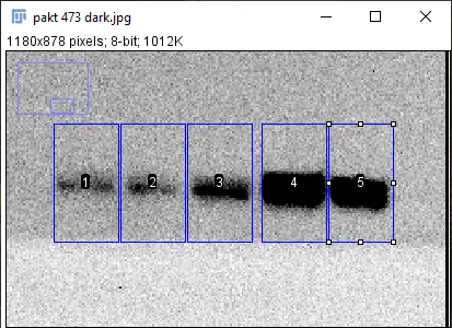
Hit 'o' on the keyboard or go to File > Open, then navigate to the folder in which you've saved your images and open up your first image to be quantified.
This is the image that was shown at the start of this article, and it consists of two strips of membranes that were imaged simultaneously under the camera (one at the top; another at the bottom; don't worry about the two random bands on the left and right, as those were molecular weight markers that were somehow being picked up by the antibody). For this example, I'll be quantitating only the top strip.
-
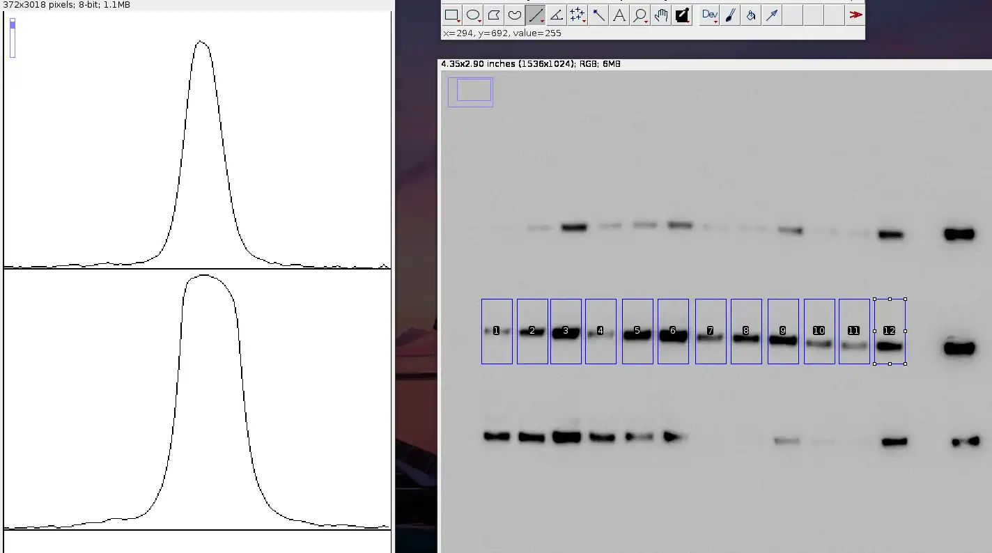
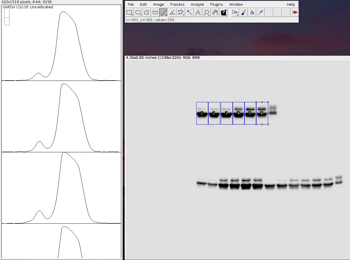
Click on the rectangle selection tool on the far left of the toolbar.
Then, draw a rectangle around your first band and hit '1' on the keyboard. You should see something like this:
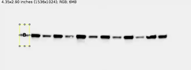
Note: Ensure that your rectangles are taller than its width. If not ImageJ will start assuming your gel lanes are horizontal rather than vertical (which is fine if your gel lanes were horizontal, but mine isn't in this case).
-
Drag that rectangle over to your next band, and hit '2' on the keyboard. Then drag it again to the next band and hit '2' again, and repeat until you've got all the bands covered.
Note: You do not have to always select all the bands in one go. For example, you can select six bands first, continue on with the next steps until you get their numbers, and then only proceed to do the same for the next six bands. What's important is that before you proceed to the next step, you have at least one control group's band selected (this relates to the foldchanges that I talked about at the start).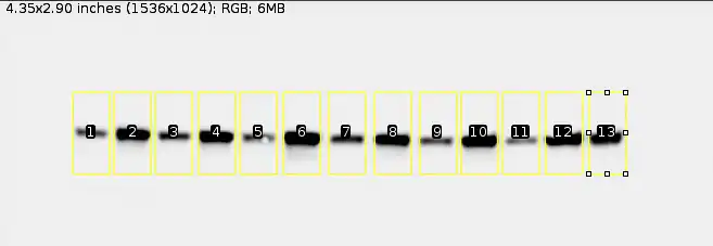
One thing you'll notice immediately is that ImageJ automatically aligns all the rectangles horizontally, so do ensure that when you draw the first rectangle, make sure it's tall enough so that it can cover the last band (or rotate the image first and make sure all the bands are at the same level).
-
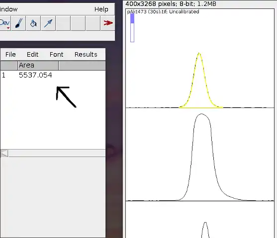
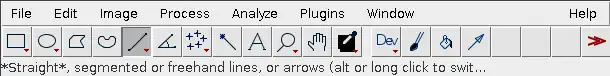
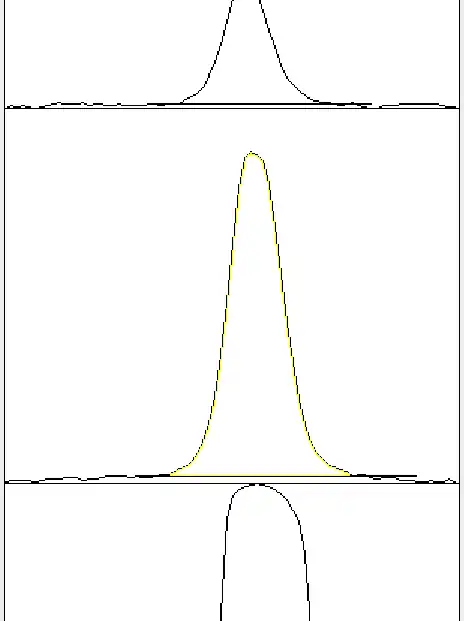
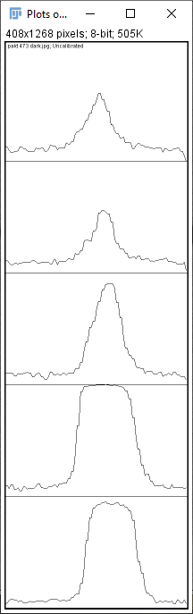
Once you're at the last band that you wish to quantify (as shown above), hit '3'. A new window should pop up.
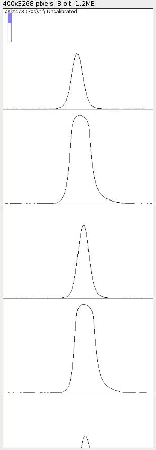
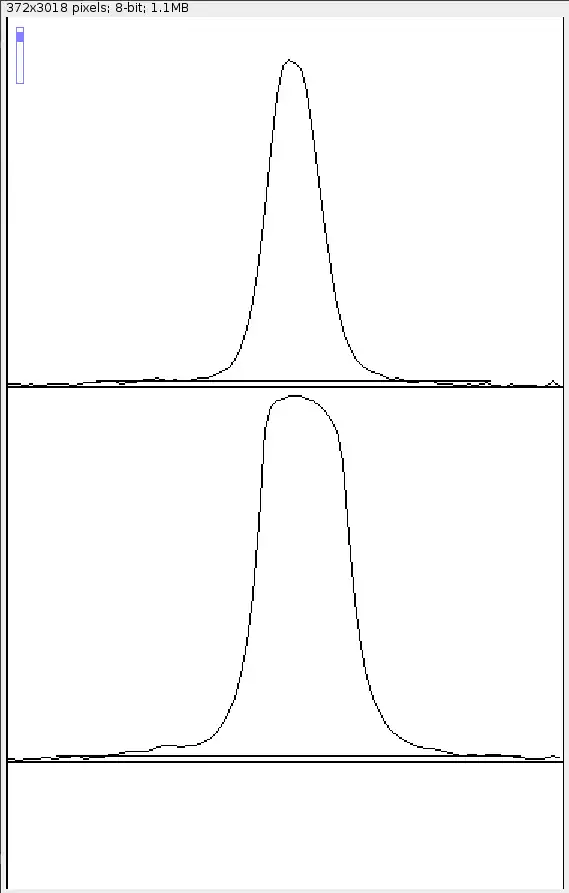
You will see a total of thirteen plots, each of which corresponds to a single rectangle selection. The numbers on each rectangle describe the order in which the plots are arranged.
The y-axis of each plot tells you about the horizontal sum of pixel grey-values or simply put, "darkness" of the image area within their corresponding rectangles. As you move along the x-axis from left to right, it's telling you the "darkness" of the image area as you move from top to bottom of the rectangle. Thus, you can see that on the left and right of each peak, it's a flatline as there is essentially no "darkness" above nor below each band.
I hope I'm making sense.
-
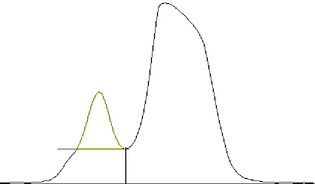
Next, select the wand tool.
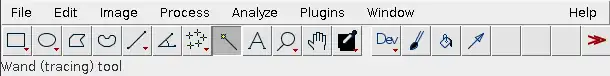
Then click on the region enclosed between the peak and the x-axis. The region will become highlighted in yellow and a new table should pop up.
The number on the table indicates the overall darkness of the band, and is based on the area of the region highlighted in yellow.
-
Ensuring that you've still got the wand tool selected, you can proceed to do the same for the rest of the plots. You will see the table fill up sequentially as you click.
Note: Arguably, one of the most important things during this step is to pay attention to each number shown on the table. Ask yourself, do they make sense? Do the numbers correlate with what you see on the actual images? Does a darker band have a larger number, and a lighter band have a smaller number? If the numbers don't make sense, you've probably done something wrong and you should start over from step 4.
-
Copy the numbers over to a spreadsheet.
-
Close all windows except the ImageJ toolbar and repeat the procedure from step 3 onwards for each image you want to quantitate.
Subtracting background signals
The example blot given above has a nice, light-grey background due to the strong signal produced by the bands. Most of the time though, this isn't the case. These are what you'll encounter more frequently instead:
You'll see that the graphs for these bands do not taper nicely to zero, as the background is dark enough for a signal to be picked up.
-
To remove the background signal, first select the straight line tool.
-
Draw a straight line horizontally (tip: hold the shift key to draw perfectly level lines) to "cut away" the background signal. Use common sense to figure out how high you want to place the straight line. The straight line's height should roughly be the same on each graph (as the background signal is even throughout the entire image).
Note: Do ensure that your lines completely cut across the peak, and not just halfway. If not later when you highlight the peak with the wand tool, the selection "leaks" to the region that you intended to remove.
-
Then use your wand tool to select the region enclosed between the peak and your newly drawn straight line, as per usual.
Check that the yellow-highlighted region is indeed the region that you intended to select, and it doesn't spill over to the background signal region which you cut away in the previous step.
-
Copy the numbers over to a spreadsheet as usual.
Here's a more severe example, where the image is dark and grainy.
You can see that the graphs are really fuzzy due to the graininess of the image, and they don't even start nor end at zero due to the darker background. However, the background signal is removed the same way by using the straight-line tool:
Bands in close proximity
Now let's consider another scenario, in which two of your protein of interests are in really close proximity of one another, and you don't want to run two separate gels just for each protein, nor strip the membrane (I am personally not a huge fan of stripping due to a lot of reasons, the main ones being a waste of time and unpredictable protein losses).
Or, you have a protein of interest that's in really close proximity of your housekeeping protein, which you definitely need to quantify. You would therefore, end up with two bands that are really close to each other:
It would be quite the challenge to select just the upper or lower band, but not both with the rectangle selection tool.
So, what you would do is select both bands at the same time, like so.
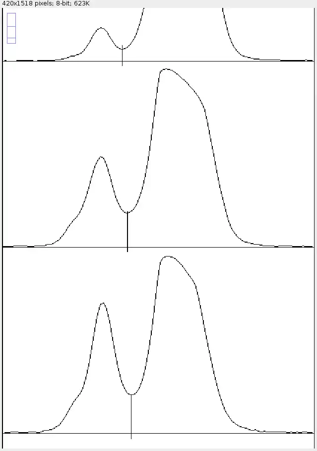
As you can see, there are now two peaks on each graph. The left (smaller) peaks correspond to the upper (lighter) bands, while the right (bigger) peaks correspond to the lower (darker) bands.
The astute among you might notice that in between the two peaks, the graph doesn't dip down to zero. And that's due to the protein smearing between the two bands, evident on this zoomed-in picture.
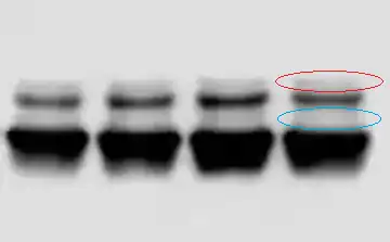
I've highlighted the smearing in red and blue circles. The graph doesn't dip down to zero due to the smearing in the blue circle.
Since it doesn't dip down to zero, you'll have to break out the straight-line tool again. This time, draw a vertical line (tip: hold shift to draw perfectly vertical lines) from the lowest point of the dip down to zero. If there's a background signal, draw a horizontal line to cut away the background signal as well, as mentioned in the previous section.
This is a pretty good approximation of the magnitudes of the two bands. Use the wand tool to select either the left or right side to quantitate either the top or bottom band respectively. Again, make sure the region highlighted in yellow is the region that you want, and it doesn't spill over to any unwanted regions.
Alternatively, let's say you wanted to quantify the top band, and you are 100% sure that the smearing is due entirely to the lower band and not the top band, you can totally remove the smearing by cutting it away like so:
I don't recommend doing this however, as in my experience it produces more variability in the dataset.
And that's all for quantification, folks!